U.S. Arctic Research Commission.
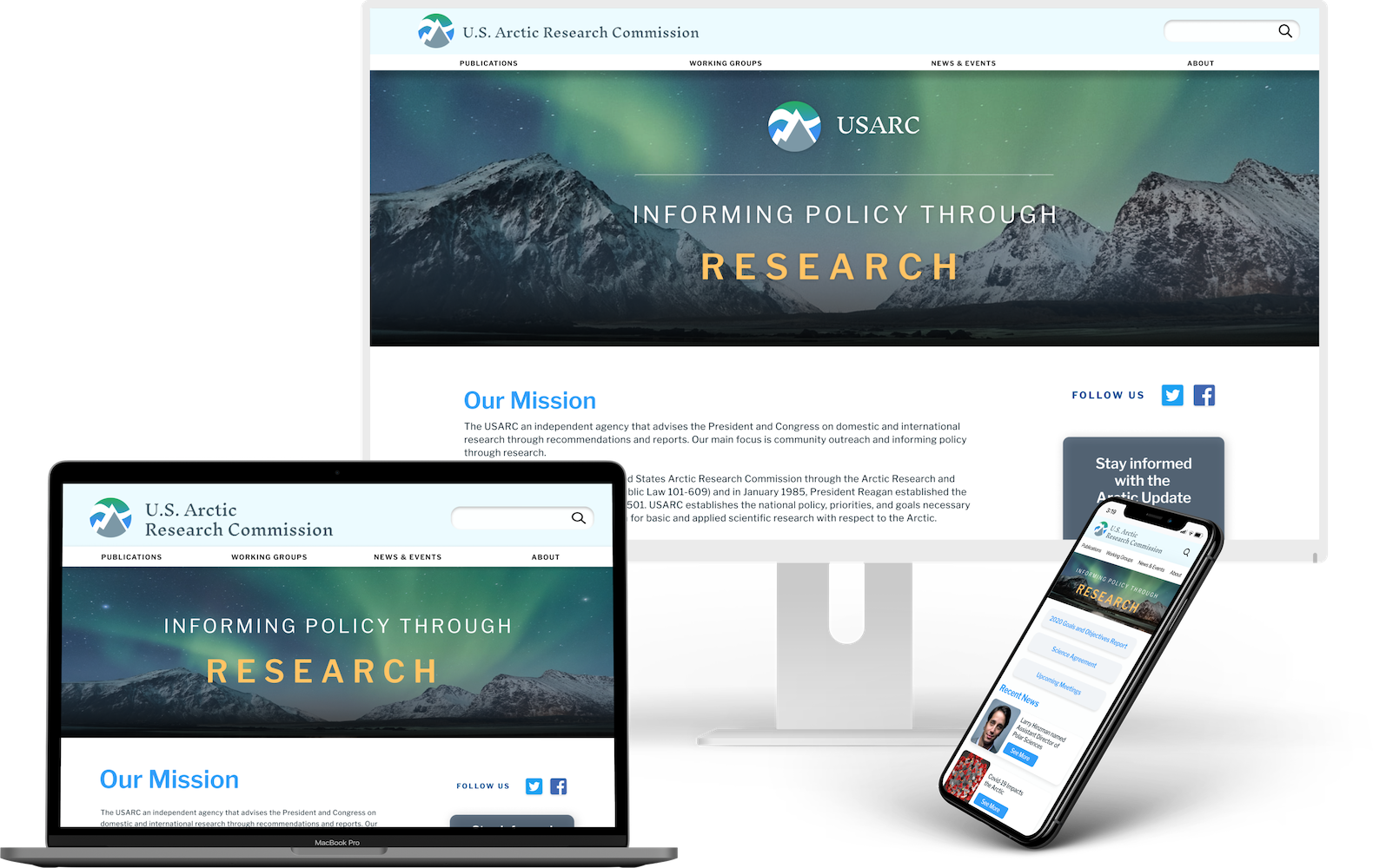
The USARC is a small government agency that provides Arctic policy recommendations to the U.S. government through research and community outreach. Their site had not been updated since 2006 and our team made a responsive redesign addressing the main issues our research found.
the deets
Team of four
Duration: Five weeks | Jul-Aug 2020
Client: UC Berkeley UXUI Bootcamp
my role
UX Researcher
UX Architect
Interaction Designer
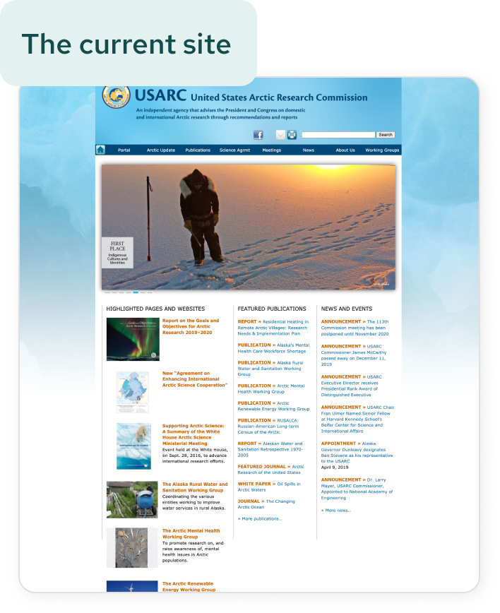
the problems.
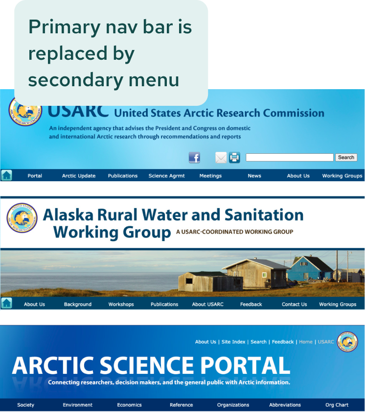
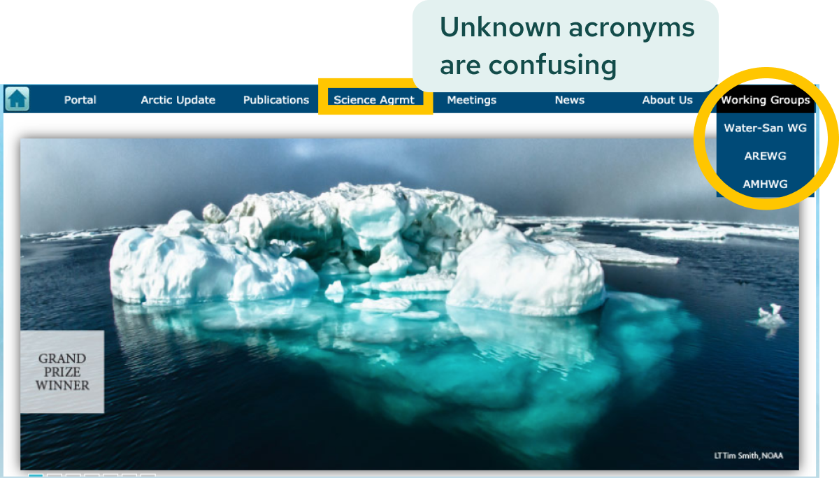
Through heuristic evaluation and usability testing of the current site, we found that the biggest hurdle to completing tasks were the inconsistent headers and confusing labeling. Some other key issues were:
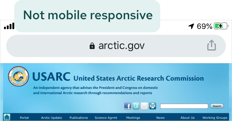
- No mobile responsiveness
- Major navigation issues: secondary nav bar replacing primary nav bar, home button no longer going home, logo only sometimes going home, etc.
- Busy homepage with lack of hierarchy and direction
- Accessibility concerns with logo and text colors
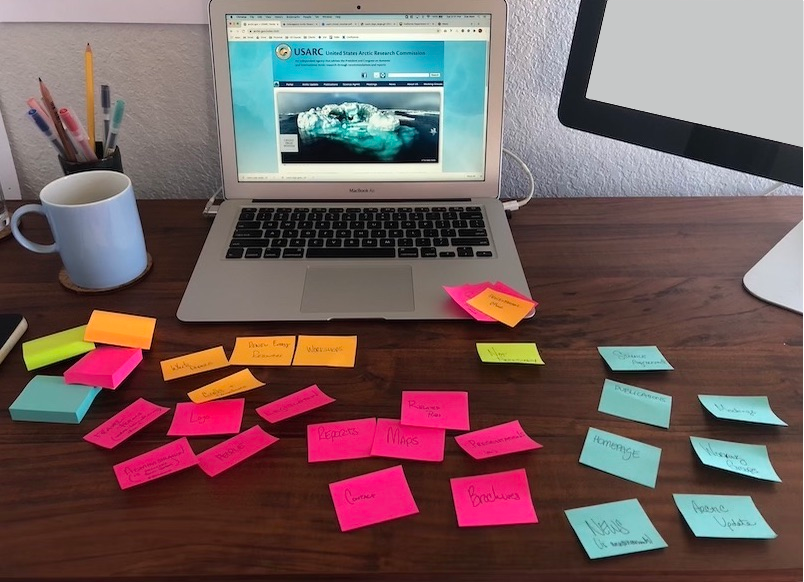
research.
We conducted five interviews and five usability tests based on our proto persona: Rick Beauregard, a mid-40s researcher living in Alaska.
interviews | 5


A lot of the things I need, specifically, can be hard to find.

It’s not for the layman. I always imagine it might be hard for computer not-savvy people to navigate.

There’s a lot going on. Not every single thing needs to have it’s own tab.
usability tests | 4
get overwhelmed by too much information and too many links and options
proved our assumptions wrong, and understand the meaning of the label “Publications”
We compiled all of our research into Jessica Holmes, our user persona.
information architecture.
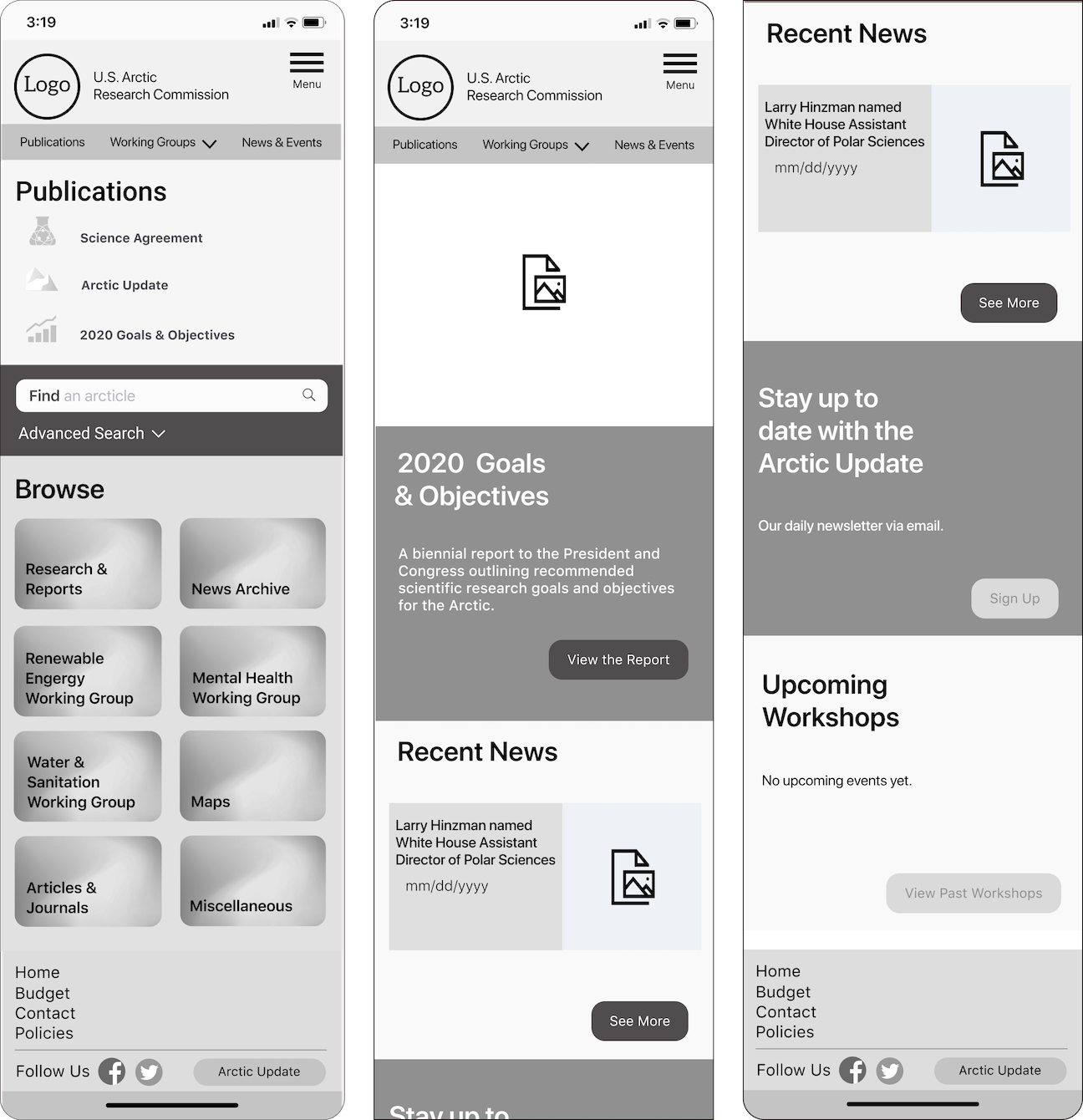
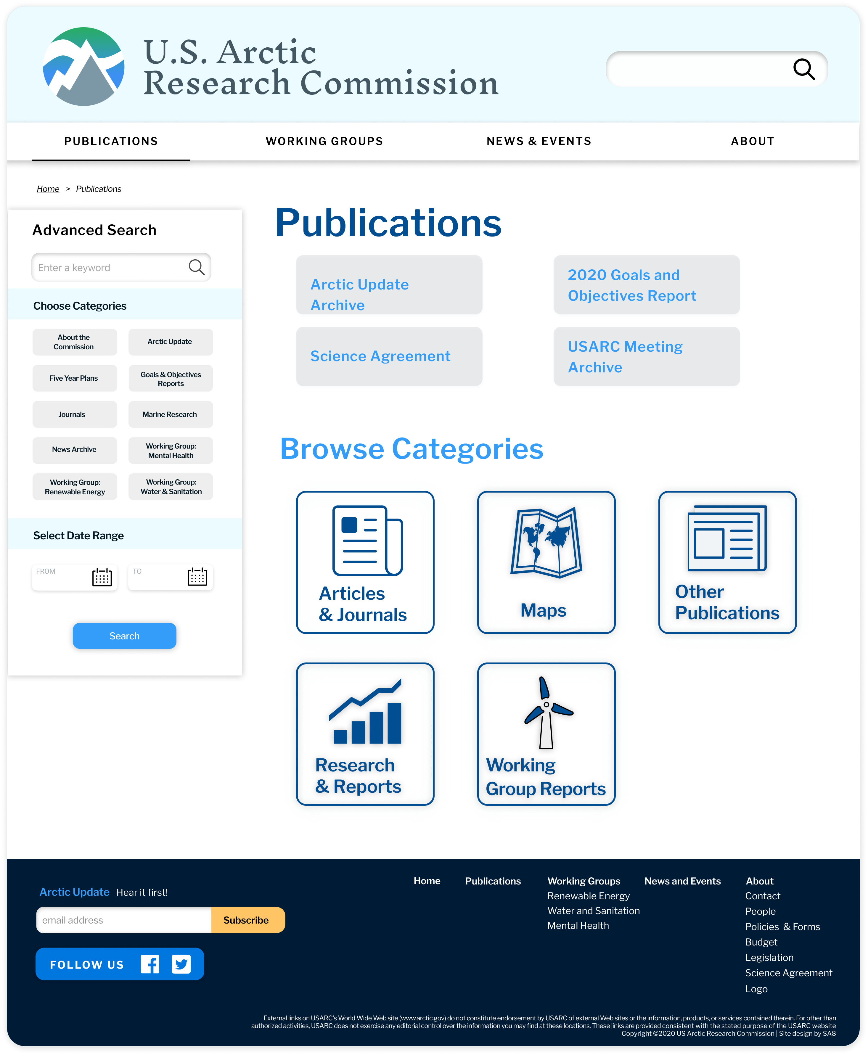
Per our research and client interview, we know a primary reason users go to the site is to find documents and research published by the organization. Users defied our assumptions and had no problem associating the location for these files as Publications so we scrapped our initial idea of changing the name. However, one area we wanted to focus on was organizing all of the publications under one location instead of the seven pages they currently occupy.
before
after
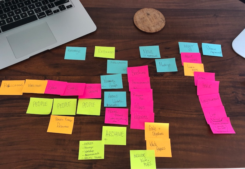
I led the remapping design, pulling all publications into one searchable page, removing pages that contain only secondary navigation and combining many pages containing similar information.
site map: original
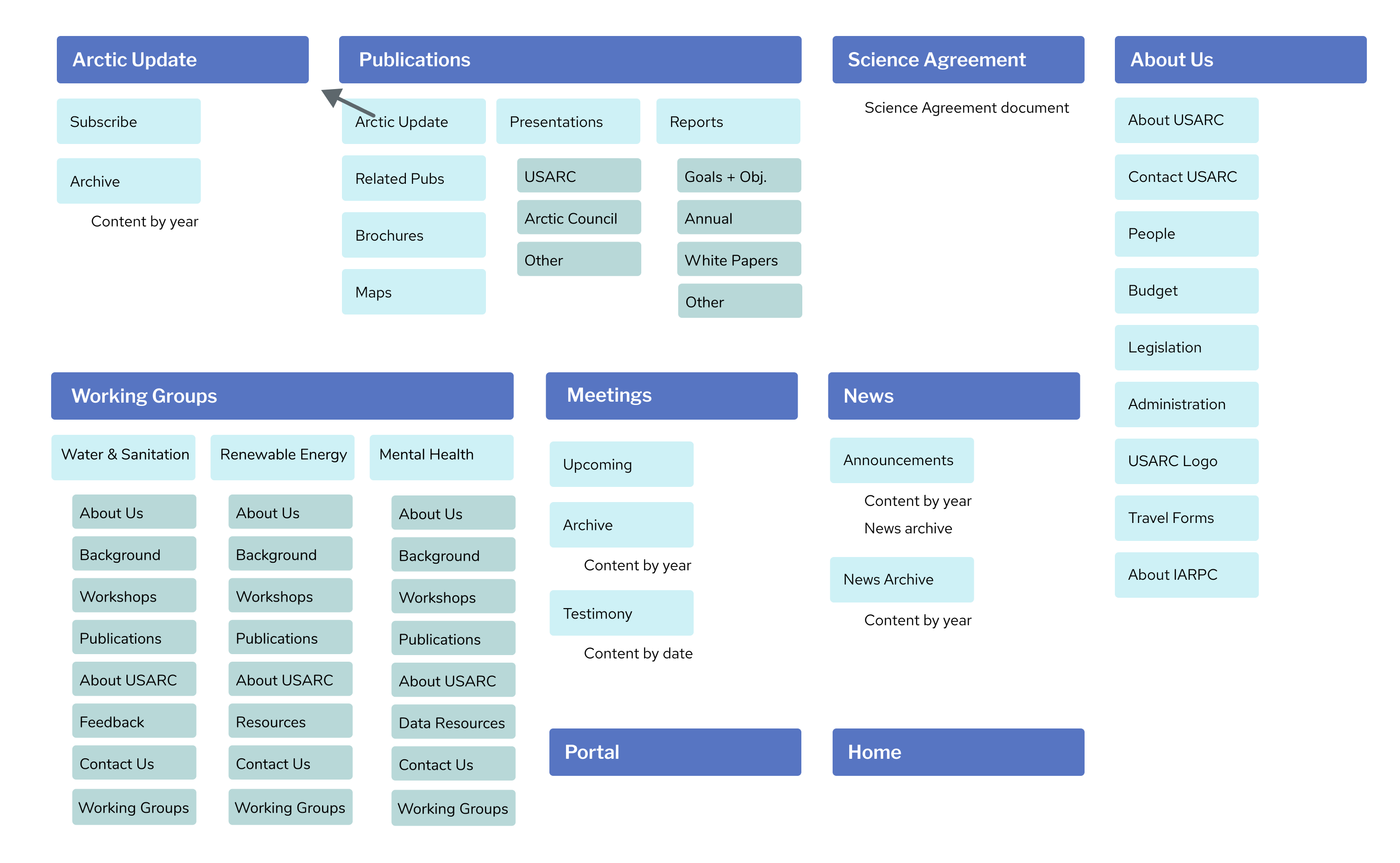
site map: revised
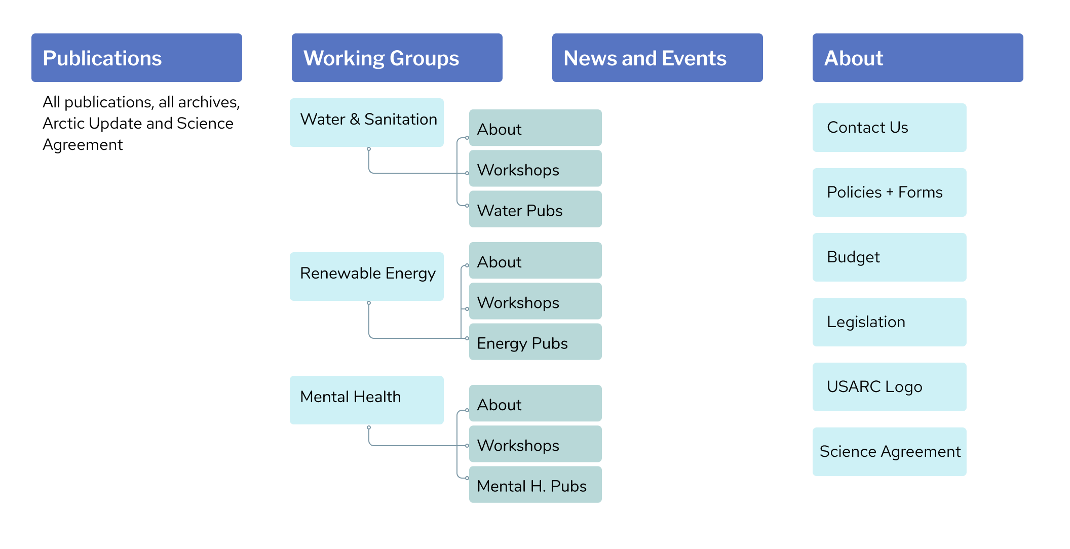
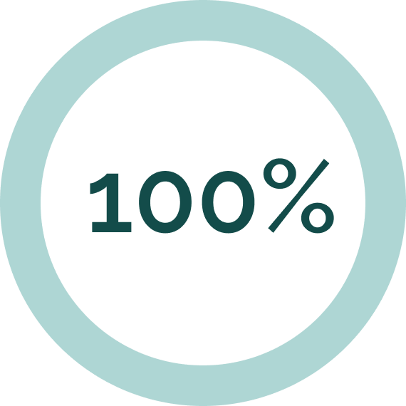
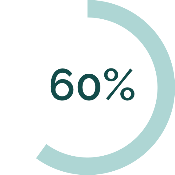
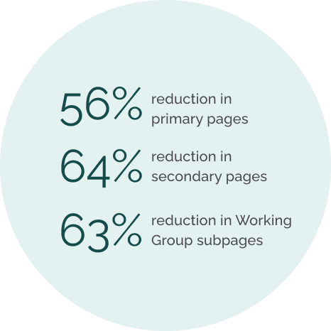
56%
reduction in menu options
ALL publications united, elimination sub pages containing only a secondary nav, and compilation of similar content.
lo-fi wireframing, prototyping and testing.
sketched wireframes
We started with mobile first as is best practice, and spent a long time deliberating the nav bar layout.
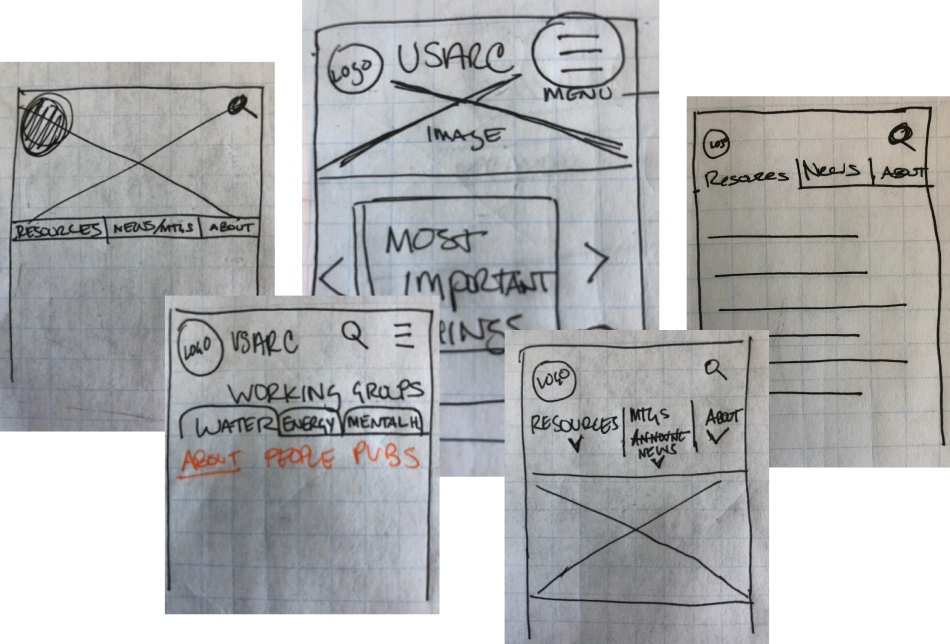
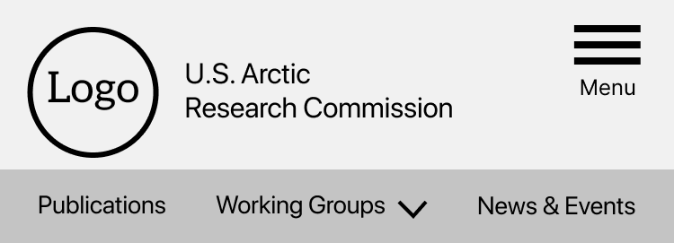
Because we had drastically reduced the number of menu options, I pushed for considering a visible nav bar with either all or the most popular items displayed.
low fidelity wireframes
A/B testing | 5 tests
My visible nav bar was met with concern, and to resolve our deliberations we did A/B testing on the hamburger menu and the visible nav.
Test A: hamburger only

Test B: visible nav + hamburger
the results:
When available, users preferred the visible nav bar. Because of our reduced menu items, we can eliminate the hamburger all together and make all items immediately visible! One of our users summed it up perfectly ⟶

The visible menus are a better way to go so I don’t have to keep going back up and clicking a link to find what I want. It’s an extra step, and we’re lazy as a species.
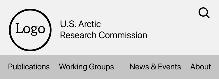
iterated header
With only four nav options instead of nine, who needs a hamburger?
the five second test | 18 tests
The Problem: Testers were not clear about the USARC’s mission. They recognize the what, but not the why.
It’s about the Arctic... I am assuming it has something to do with the environment, but I don’t know.
The Solution: I created a concise tagline describing the primary functions and goals of the USARC:
INFORMING POLICY
THROUGH RESEARCH
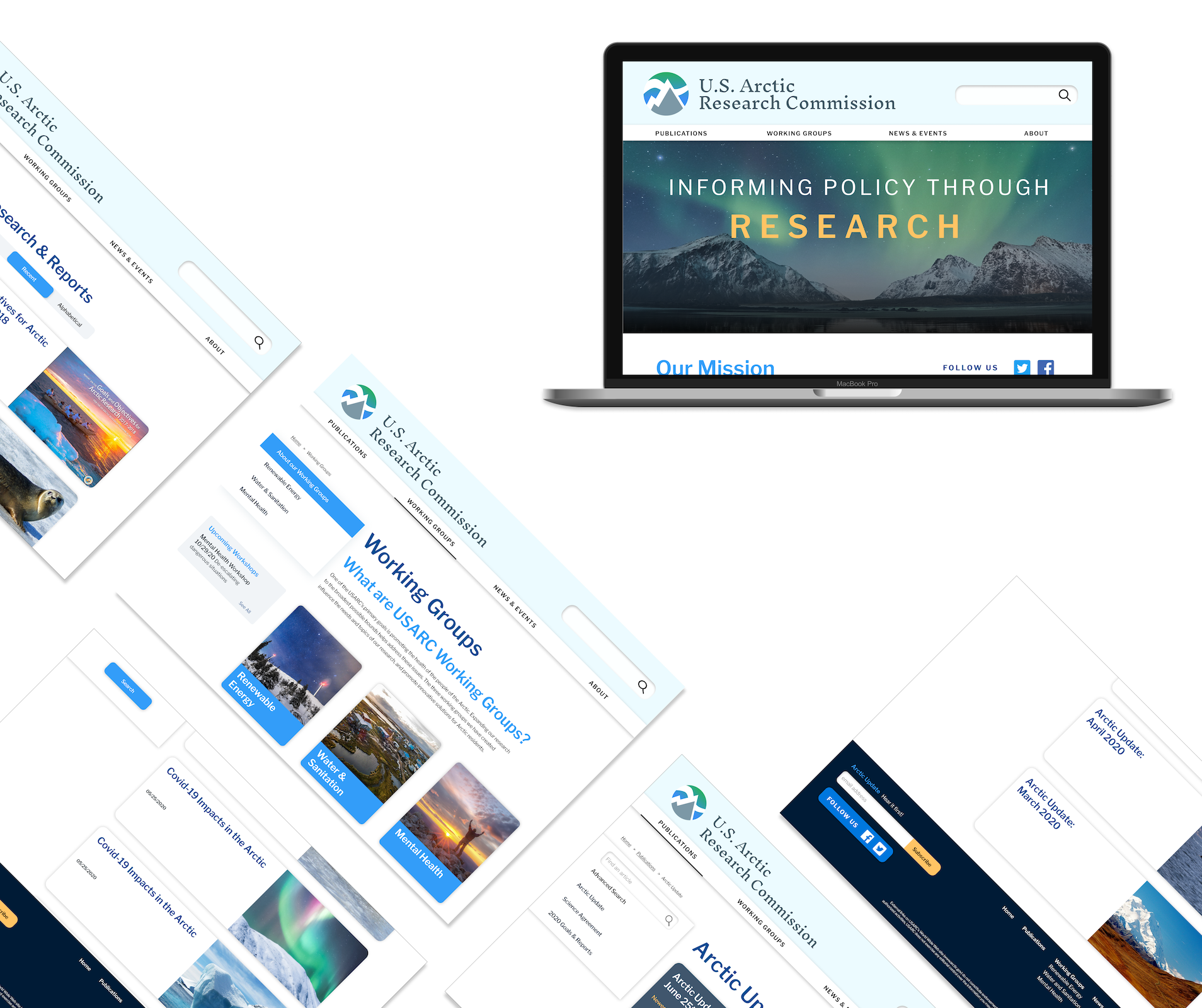
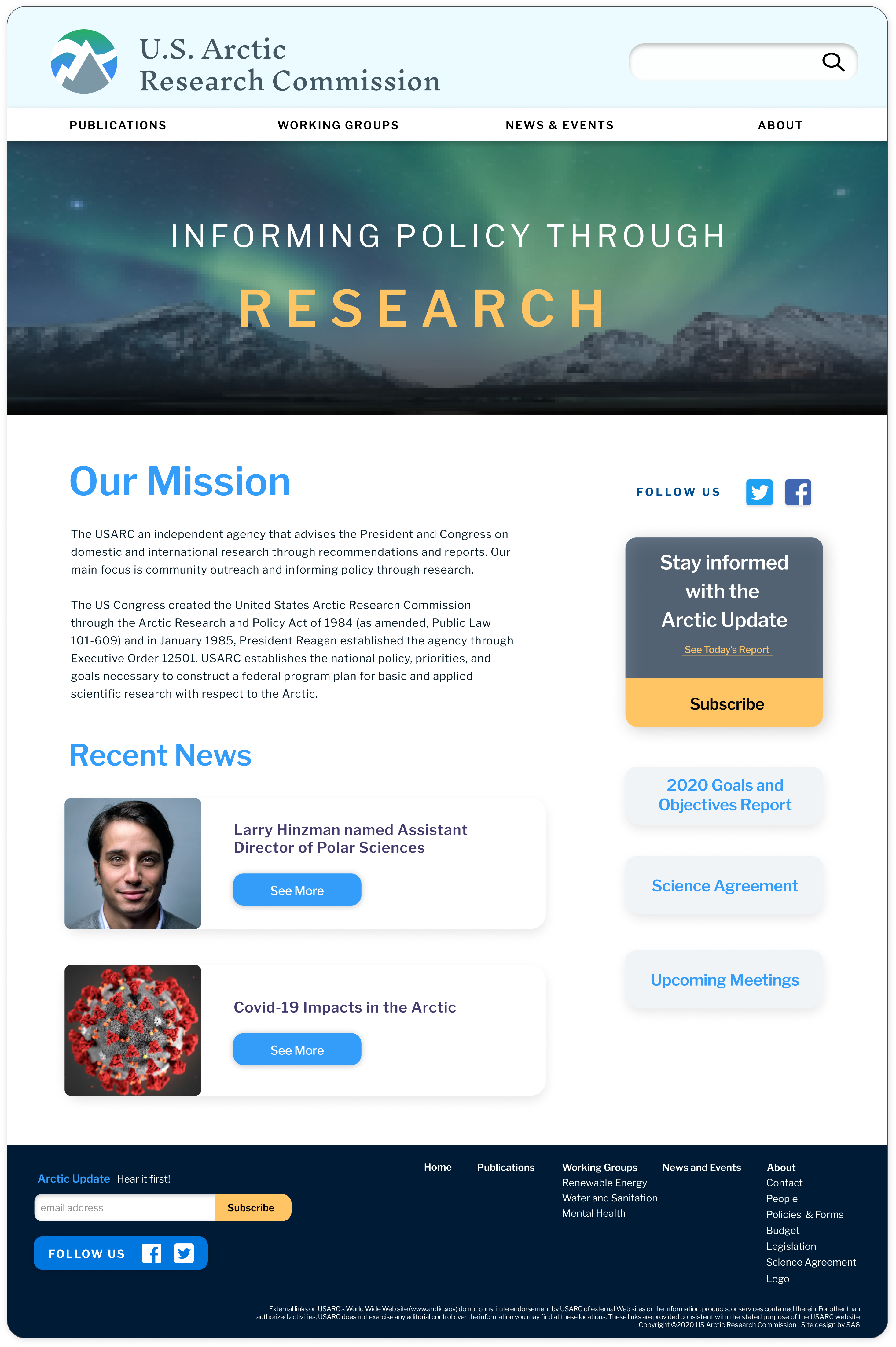
Homepage v.2
hi-fi wireframing, prototyping and testing.
high fidelity wireframing
Our style guide implemented five key words: magical, passionate, trustworthy, leader and intellectual. We tried to embody these words in our design, representing the magesty of the arctic married to the authoritative truths of this respectable agency.
more usability testing | 5 tests

All users successfully completed all tasks. Our reduced nav bar is clear and easy to use.

When moving from mobile to desktop the configuration in Publications was not accurately represented and it caused confusion among testers.
The first draft of our homepage featured a darker design to imbue magic, but this was too disconnected from interior pages.
Our headers on both mobile and desktop were larger than they needed to be.
high fidelity iteration
publications v.1
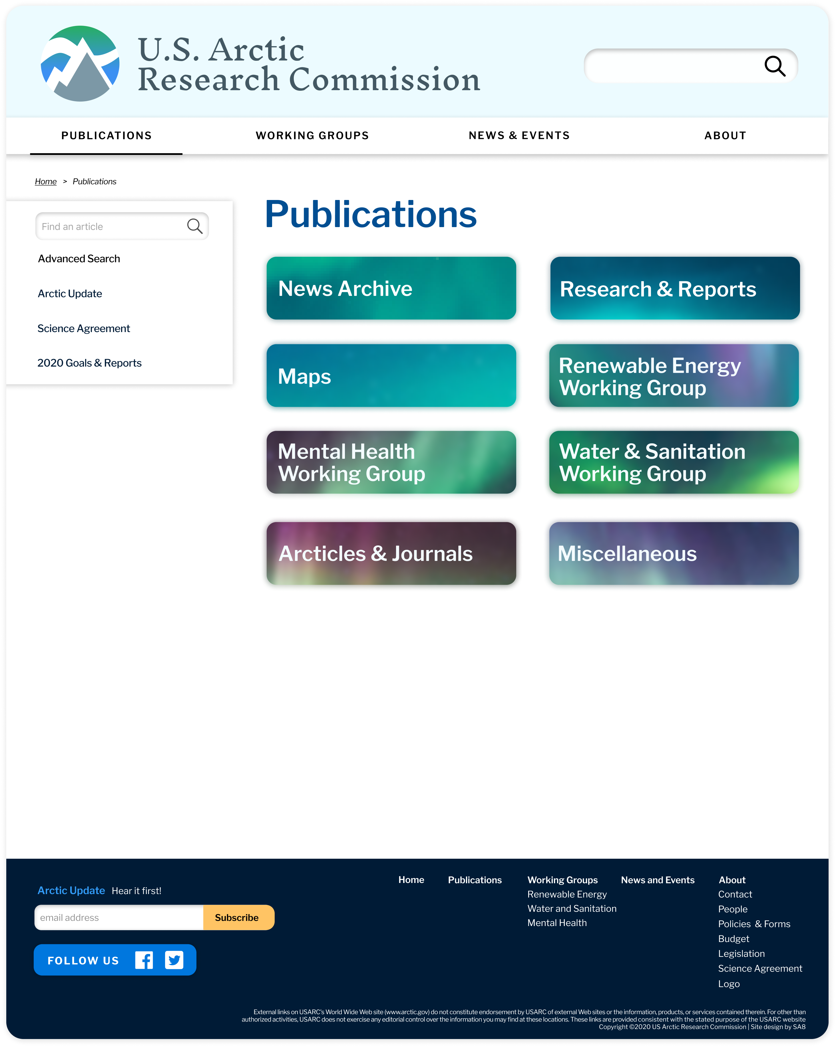
publications v.2
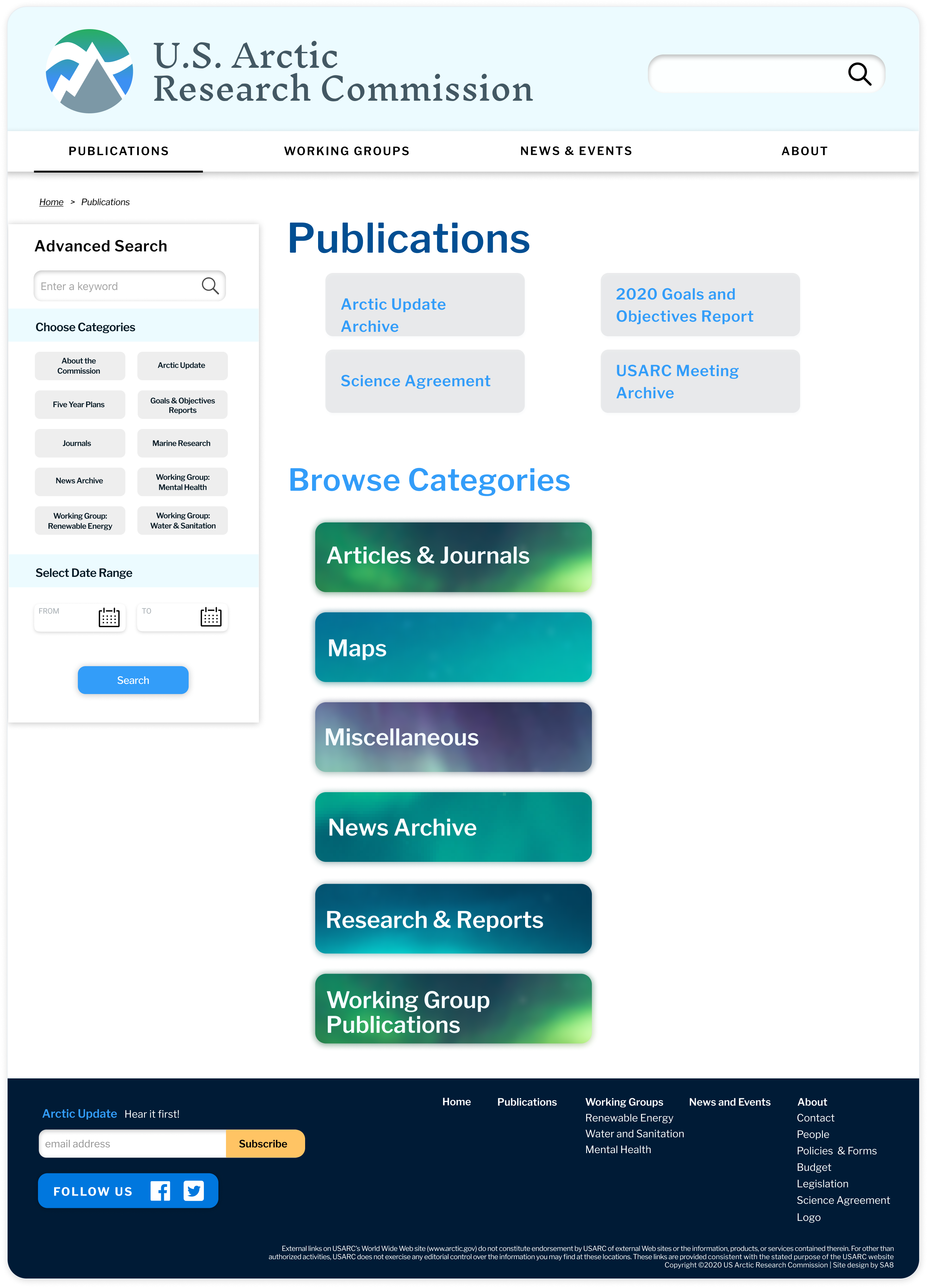
publications v.3
home v.1
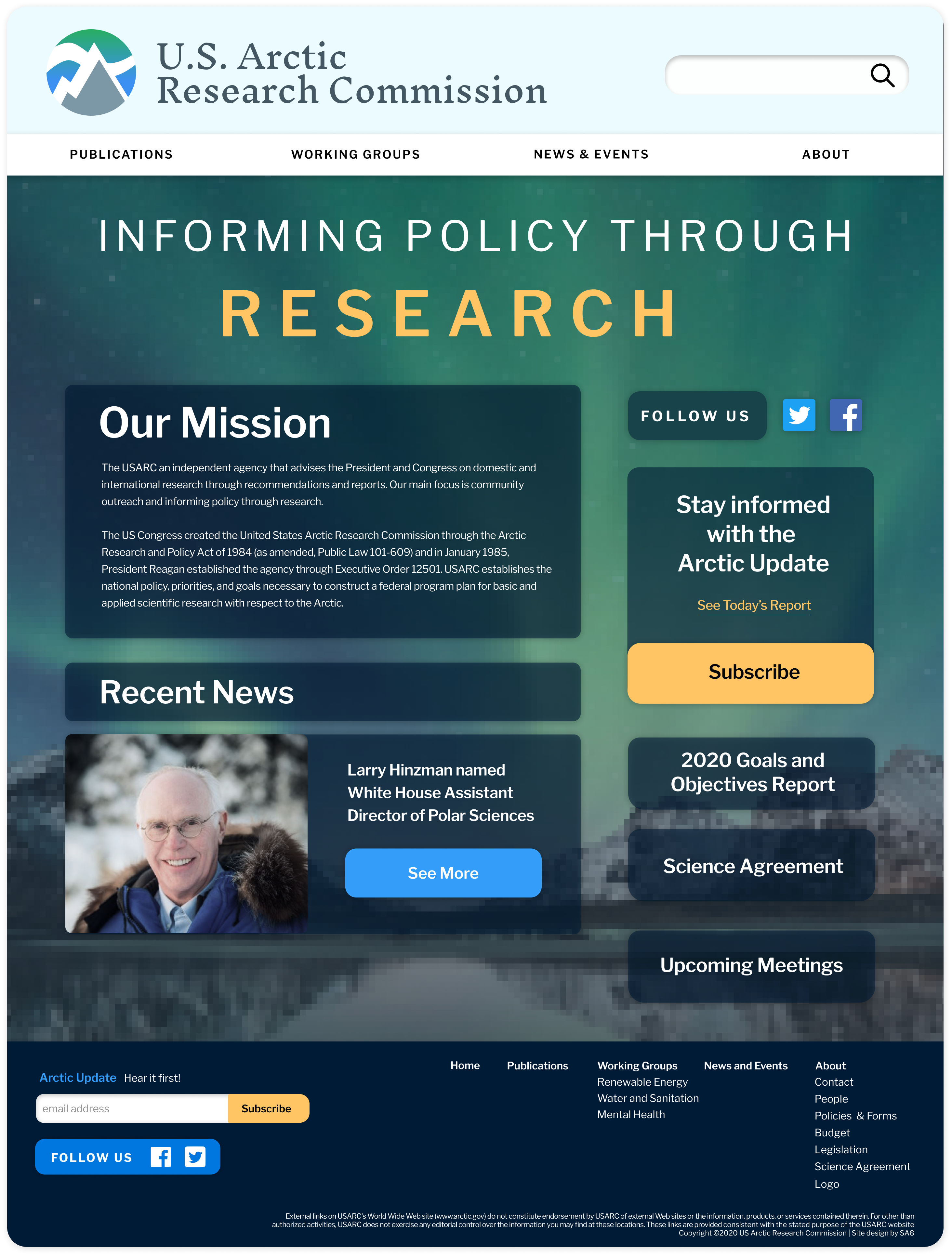
home v.2
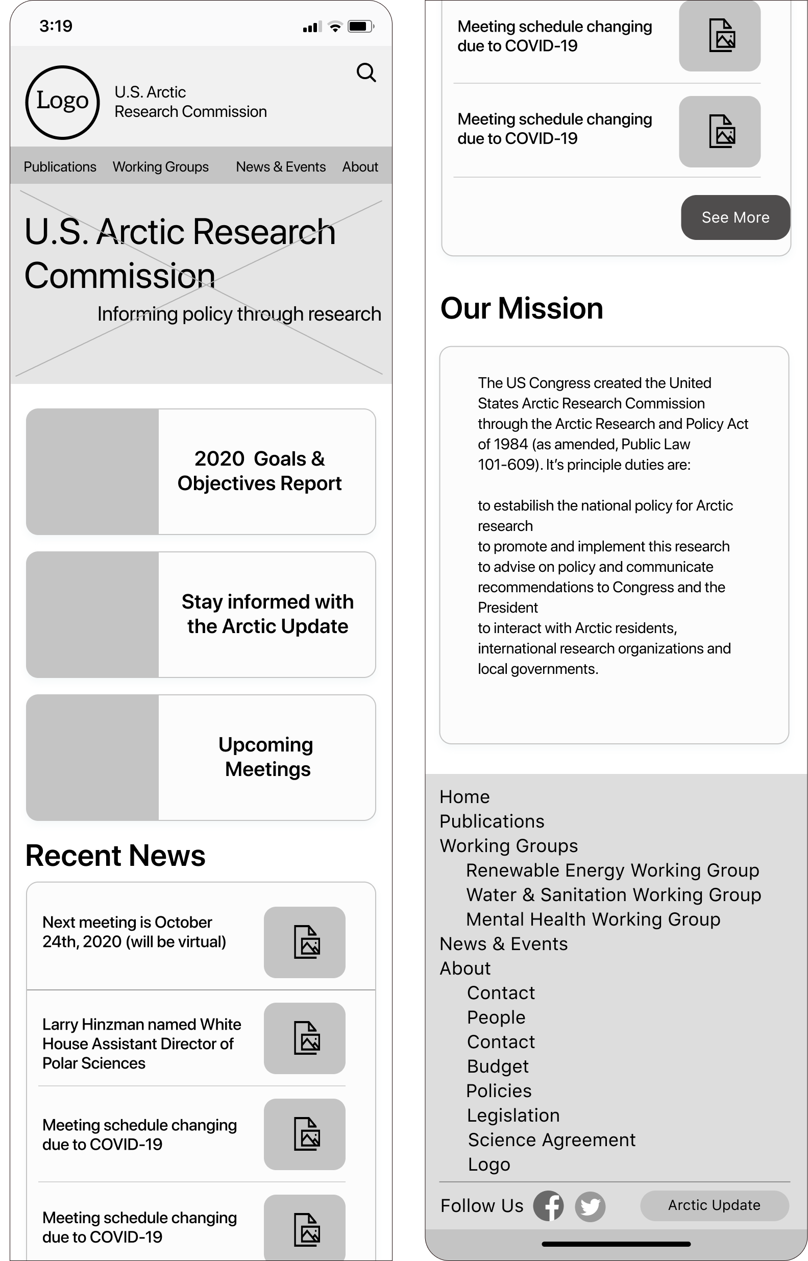
high fidelity mobile prototype
conclusion and next steps.
the results
what we learned
More Testing Needed
The search functionality in our publications section is complex and requires A/B testing to figure out the best organizational methods. More testing of label names would reveal if some terminology is unknown for first time or infrequent users.
Understanding
The importance of understanding our user as well as our client was made very apparent early on: the client helped us understand what he found most important, while users contradicted our assumptions and showed us what they found most important.
The End
Full case study available upon request