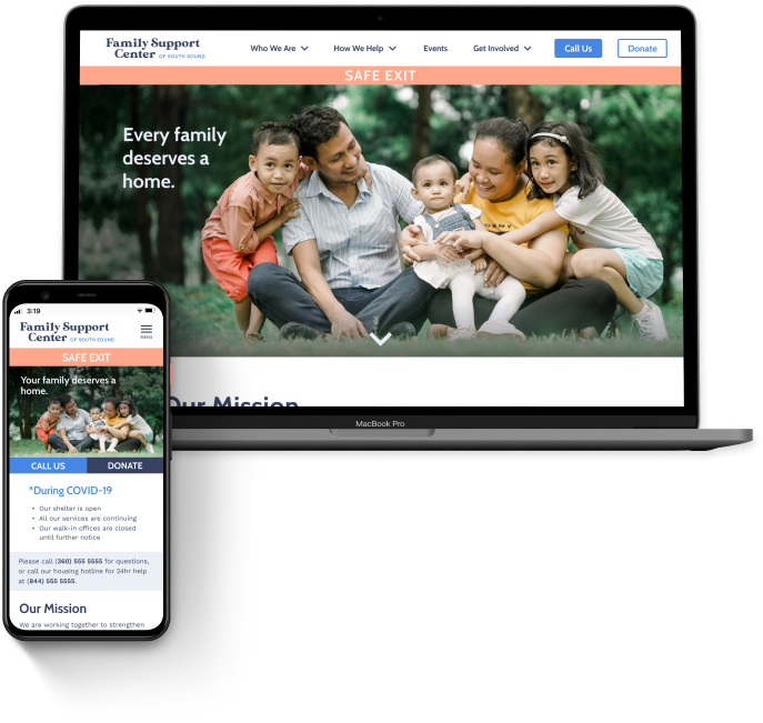
Family Support Center of the South Sound.
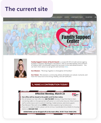
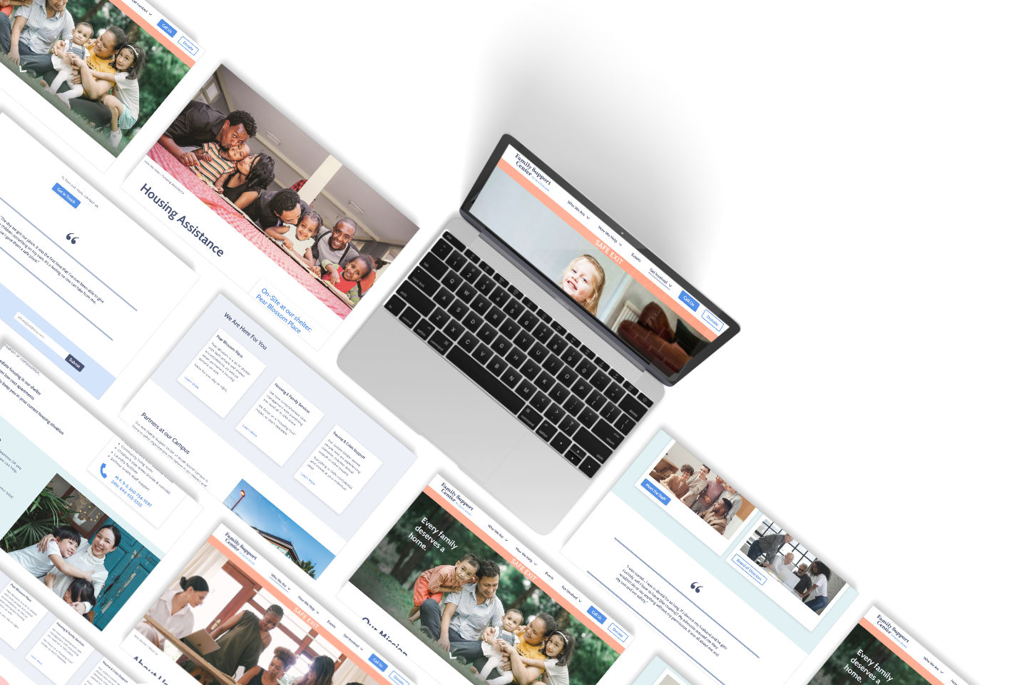
Many non-profits, like the Family Support Center of South Sound, often struggle to allocate resources to web design, even though they rely on their online presence to help serve their community and accomplish their mission. The Family Support Center is doing amazing work to support their community, assisting with people experiencing homelessness or domestic abuse, providing housing, goods, and legal care, all in one place. But their website is lacking in responsiveness, and doesn't portray as welcoming of an environment as it could.
Our team sought to address the problems we discovered in interviews and usability testing, and we provided FSCSS with a responsive redesign of their site.
the deets
Team of three
Duration: Two weeks | Aug 2020
Client: UC Berkeley UXUI Bootcamp
my role
Product Manager
Content Writer
Interaction Designer
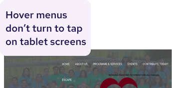
the problems.
User testing uncovered the inability of users to find the information needed to complete tasks. Through heuristic evaluation we also determined the following issues:
- Lack of responsiveness on all screen sizes
- No reading patterns or grids employed
- Hard to find what you're looking for
research.
We conducted interviews and usability tests based on our two proto personas: "the help seeker" and "the donor." We constructed our proto personas based on our client interview and evaluation of the site.
interviews
the donor | 4 interviews

I want to see that the organization is effective. And that the money goes to a good cause.
the help seeker | 5 interviews
For a long time I didn’t think I should contact them. As an immigrant it didn’t feel like my place.
survey | 11 responses
browse the internet on mobile vs. desktop
want to hear past success stories
From our research we created our user persona, Sarah Lopez. We decided to focus on the path of the help seeker because we posited that creating a comforting, welcoming, trustworthy place for her would naturally engender empathy with a donor persona and drive them to contribute.
information architecture.
card sorting
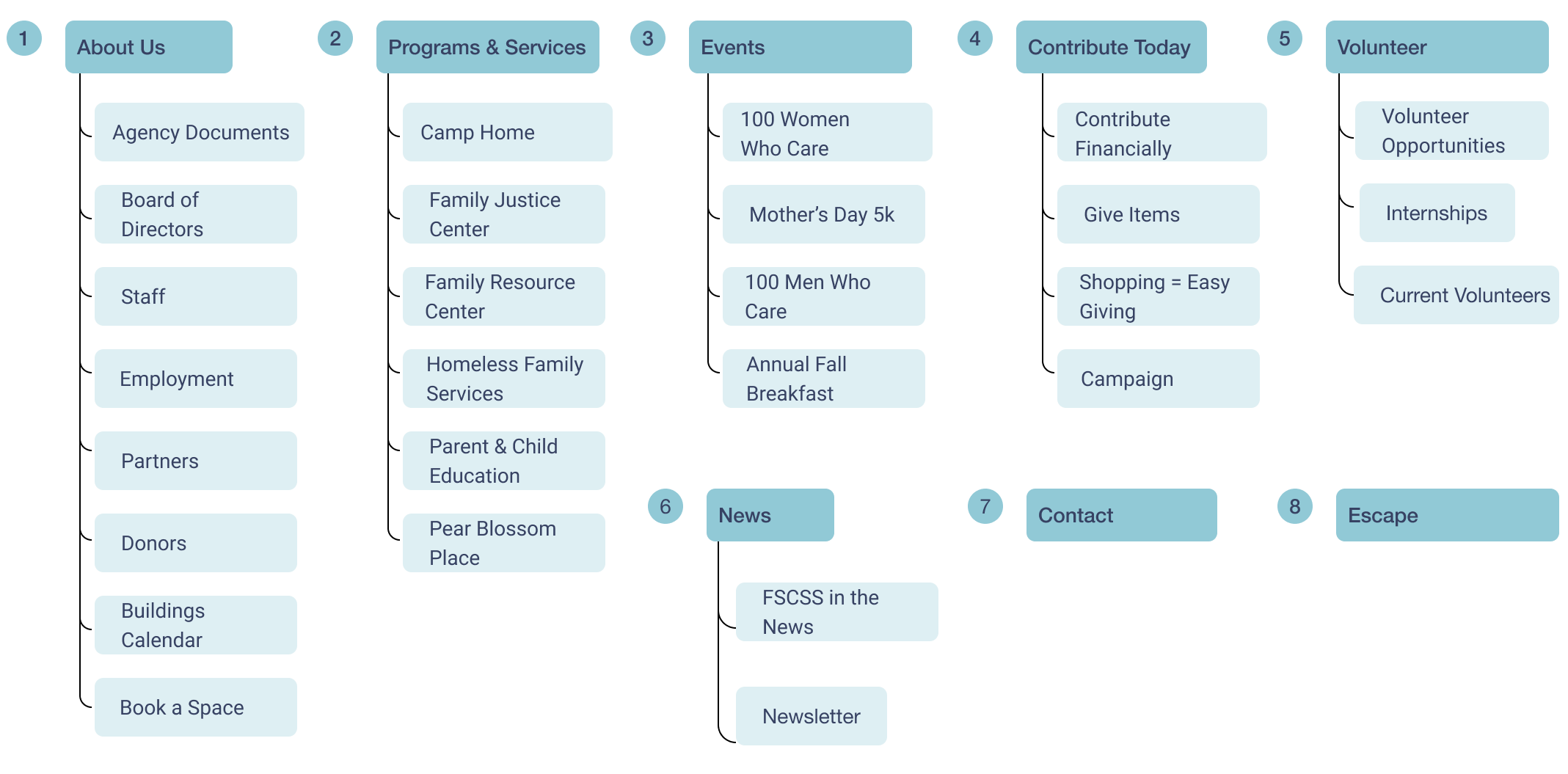
We ran an online card sorting exercise on six users. The users confirmed our initial label ideas and put all cards into four categories:
About / Who We Are
News
Programs / Services
Get Involved / How To Help
site map: original
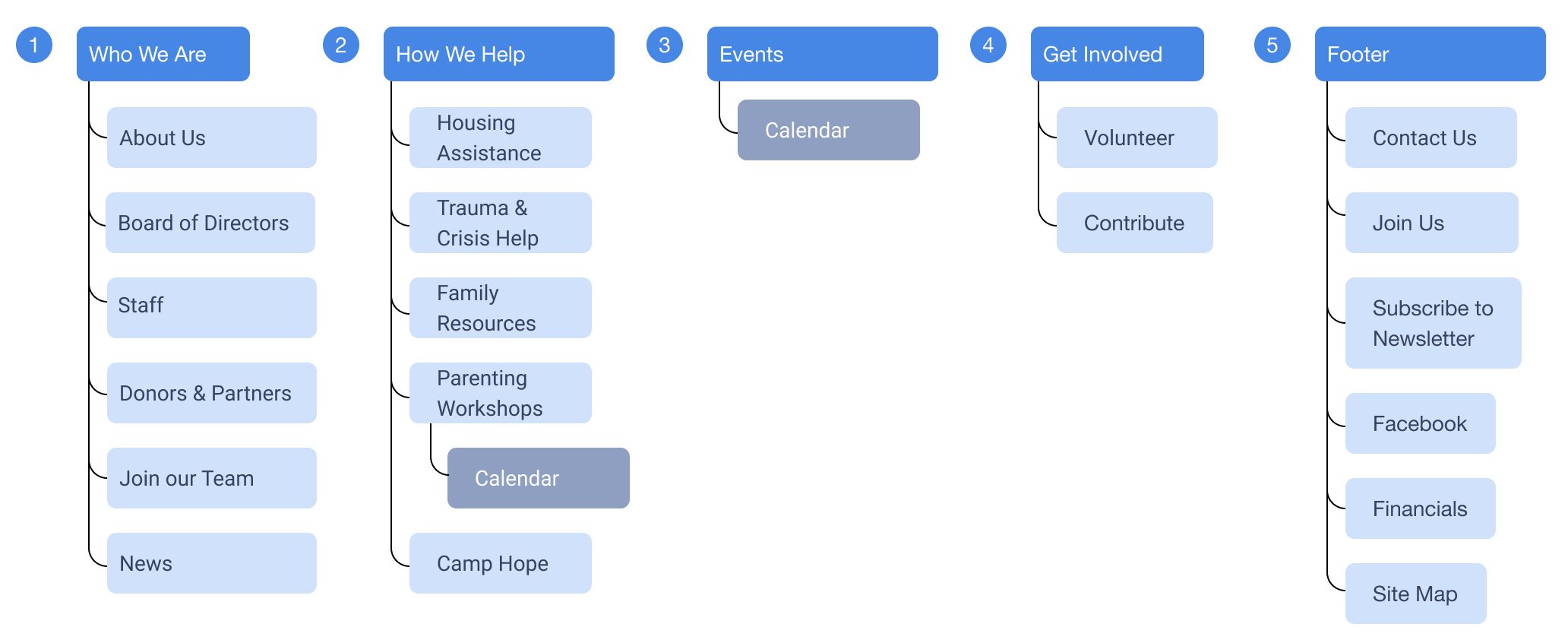
site map: revised
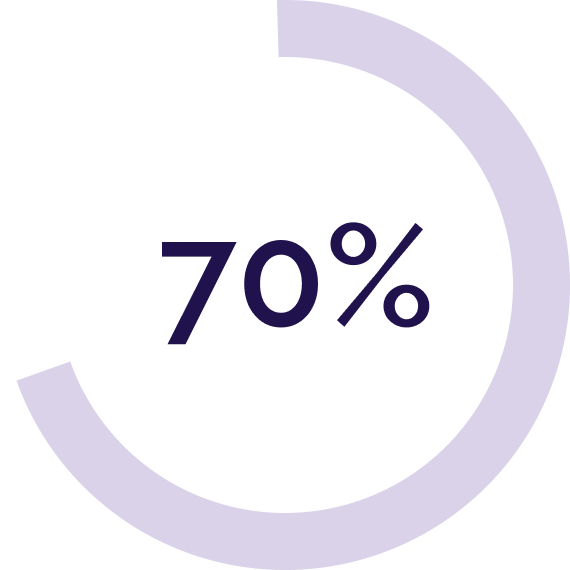
50%
reduction in menu options
By combinging similar subjects and moving the "escape" button into a global, highly noticable location, we were able to organize and streamline the navigation. The team spent a long time debating label names, and ultimately implemented some of the labels suggested by users to give an empathetic feel (e.g. How We Help, Who We Are).
wireframing and prototyping.
sketches
Paper is always my first step, for ease and speed when ideating.
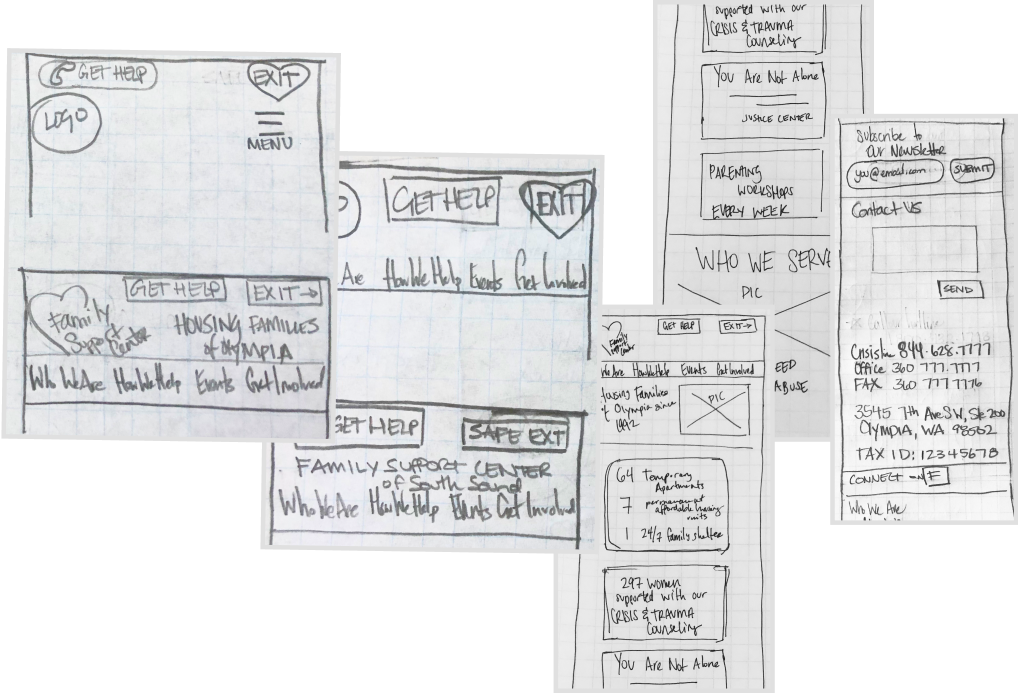
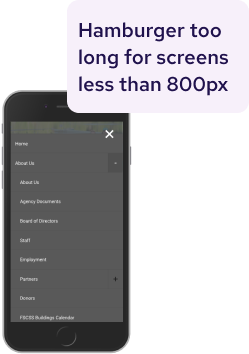
We know visible nav bars are more effective than hamburger menus, but our empathetic labels were too long to fit on a mobile screen. When choosing to use a hamburger, we opted to include the word MENU, empathizing with our users who may be low-income stay-at-home moms, less familiar with what some consider “ubiquitous” icons.
low fidelity wireframes
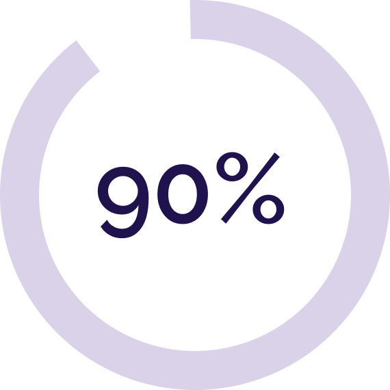
In our first draft of wireframing we focused on clear labeling and calls to action. We started with mobile first, not only because building from micro to macro is good practice, but because 90% of our survey users browse on smartphones over desktops.
testing. round 1 | 5 testers

Quotes feel relatable and give a feeling of hope
Boxes around phone numbers in footer highlights it well

Desktop users were confused by “call us” buttons (brought from mobile)
Headers are too long, cutting into reading space when sticky
iteration. round 1
high fidelity wireframes with test analysis implementation
testing. round 2 | 5 testers

the problems
Users were unable to understand available services clearly
60% of users went to Events page when looking for Parenting Workshops
Removal of “call us” buttons on desktops left users still wanting a clear CTA
More diverse photos made some users feel welcomed and some feel discomfort

the solutions
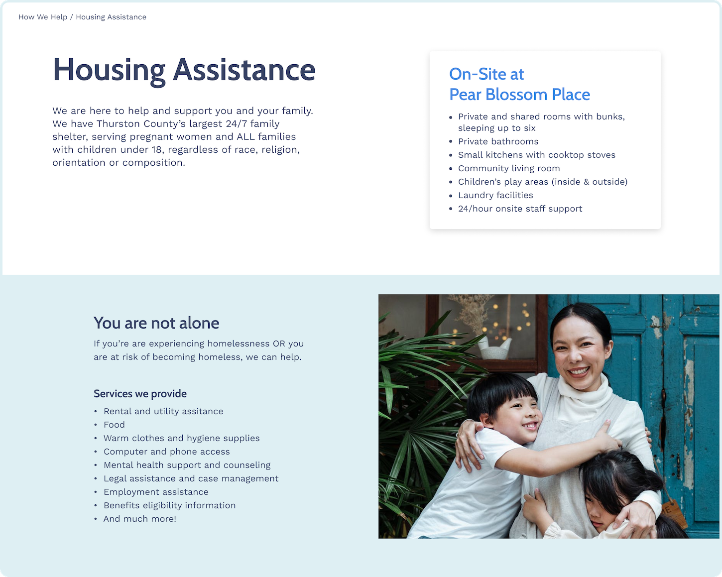
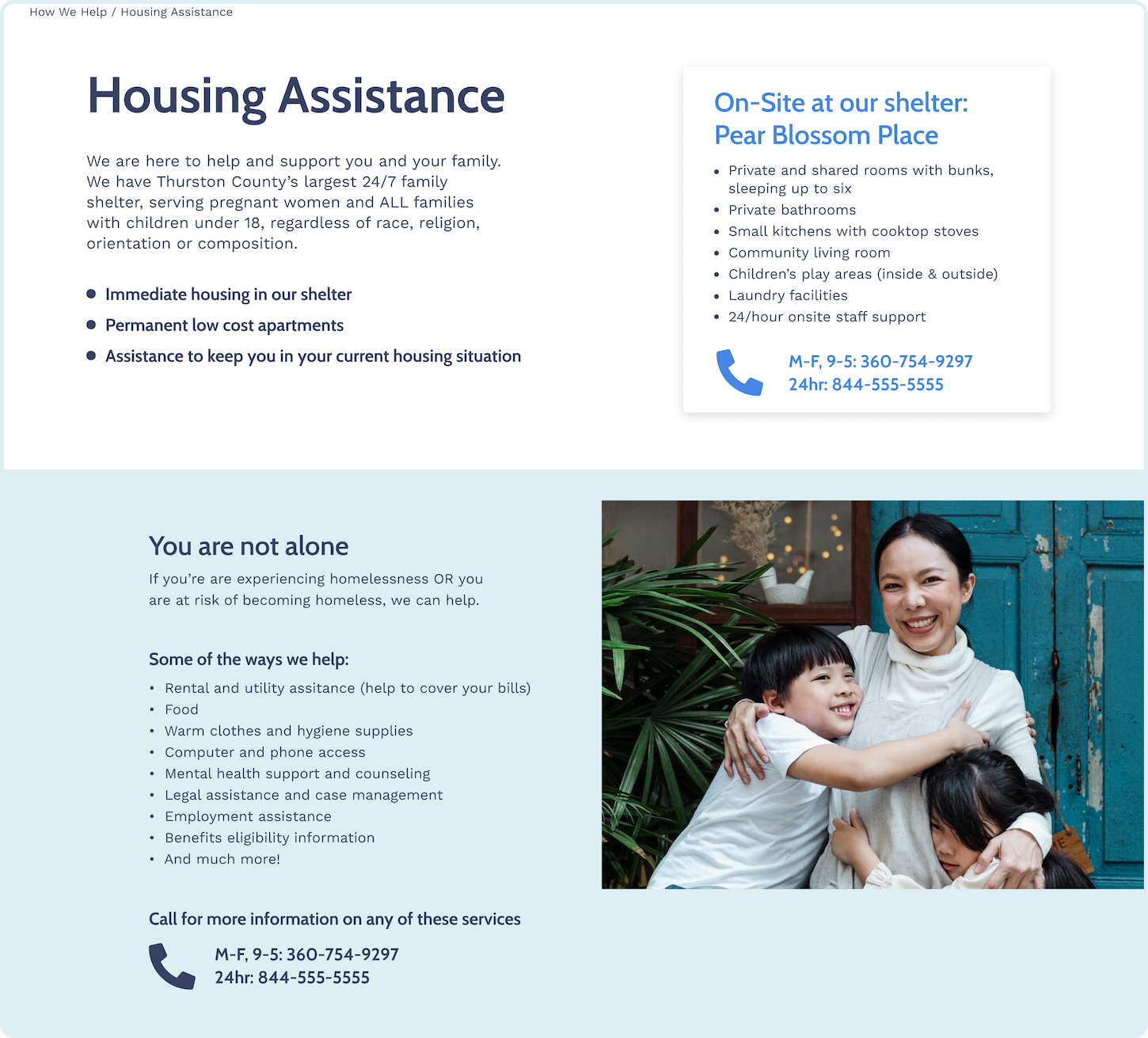
Elaborated on copy to improve clarity in the Housing Assistance section
Added sub menus to Events tab: “Workshops and Annual Events”
Inserted phone icons and written out phone numbers in multiple locations
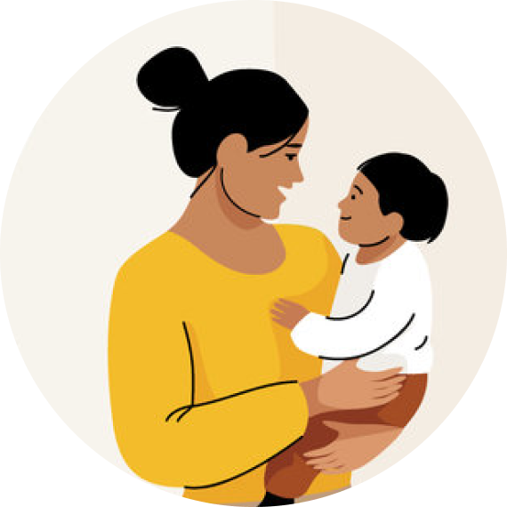
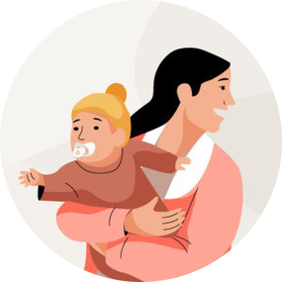
Race in imagery based on demographic percentages of those using FSC’s services
iteration. round 2
This is one of the iterations we made to solve for the problems found in our user testing: increased clarity via more content and written out phone numbers.
before
after
high fidelity mobile prototype
conclusion and next steps.
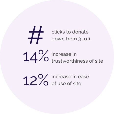
the results
what we learned
Empathy
Every member of the team had long, eye opening conversations with people who have experienced homelessness, and in most cases, domestic abuse as well. We were all shown a different perspective on a serious and frightening experience.
Iteration
Along with analysis from further testing, we would like to create filters for the calendar sections to make them easier to use and implement more success stories and statistics from the client, as that was a key item our users wanted.
Unconcious Bias in testing
We inadvertantly had a round of testing that only included white females and they had varying responses to the diversity in our imagery. Luckily we had received demographic information from the client and we were able to base our imagery off of actual recipient demographics, but it was very interesting test
More testing needed
Our last round of testing revealed some interesting cases of unconcious bias amongst our female, white testers; further testing with a more varied racial group would be required to make accurate conclusions. We would like to conduct A/B testing of CTA buttons to determine colors that attract attention.
The End
Full case study available upon request